
Wayfarer Design highlights
Final Designs
Desktop
Mobile
Project overview
Wayfarer is a responsive travel website concept that helps users discover destinations tailored to their travel preferences while uncovering hidden gems and highly rated spots recommended by other travelers. The project focused on creating a cohesive visual identity and a seamless experience across desktop and mobile.
Visual Identity
Icons
From concept sketch to final destination, I designed a custom set of icons for Hidden Gems and Top Spots for the homepage and virtual map components.
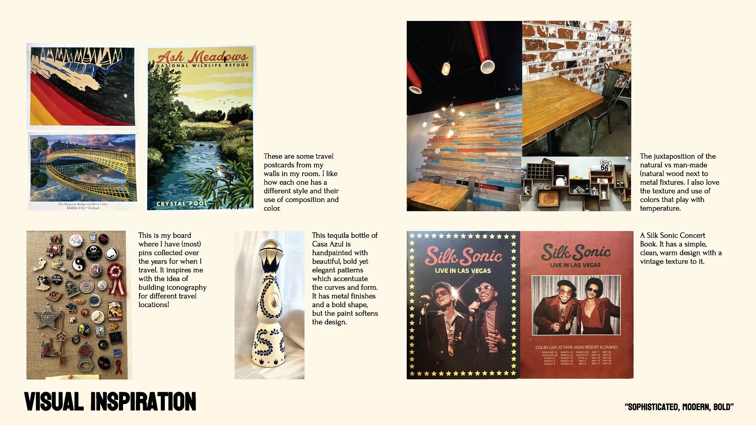
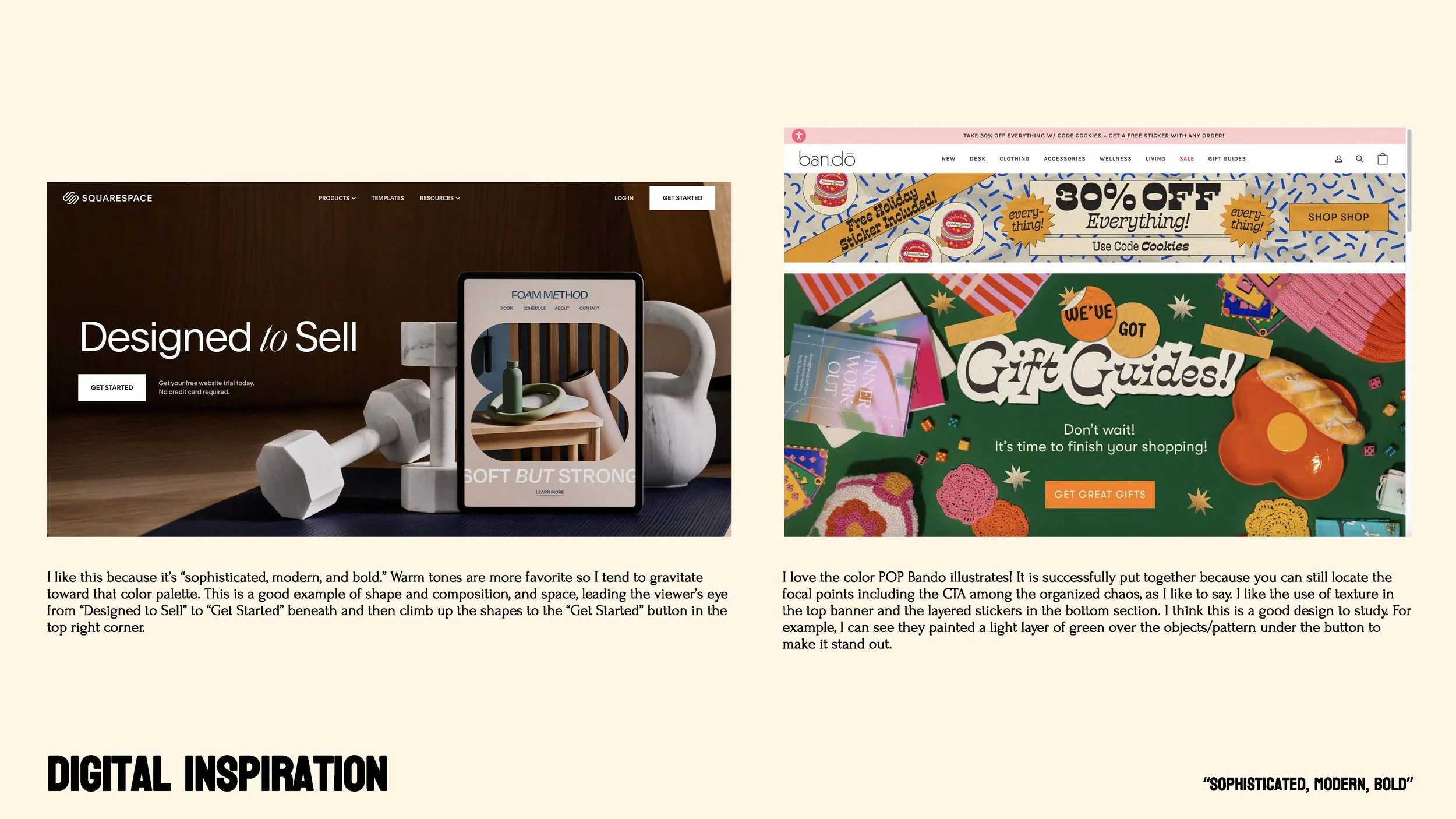
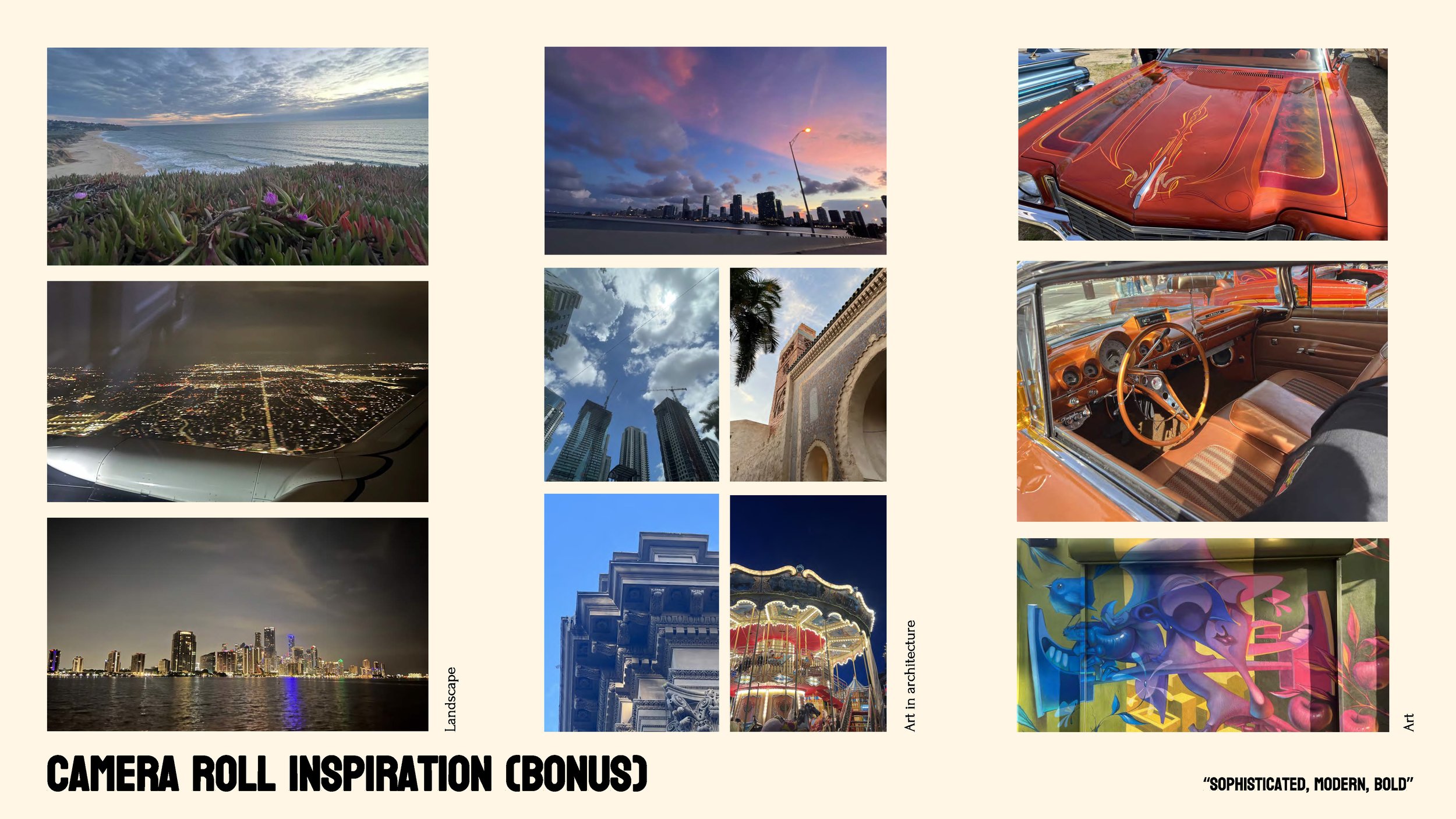
Design Inspiration
Low-Fidelity Prototype sketches
Animation - My idea for the screen transition is let the orange circle consume the whole background on the device. Then, to take the paper plane from the progress bar and enlarge. It is planned for the plane to fly toward the right of the screen as well after enlarged.
User flow
Homepage
Travel Preferences Form
Destination Matches
Destination Details
Let’s adventure!
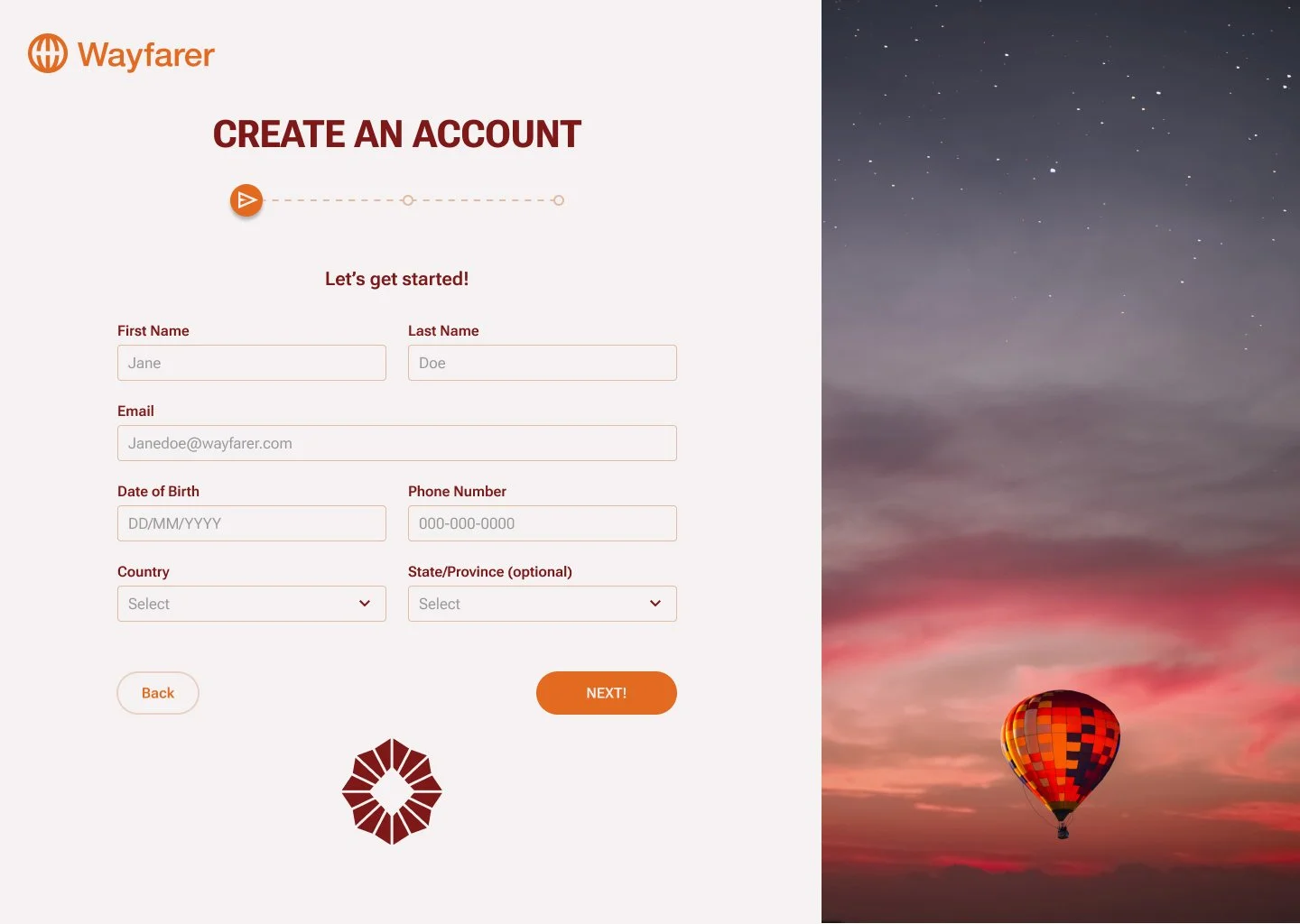
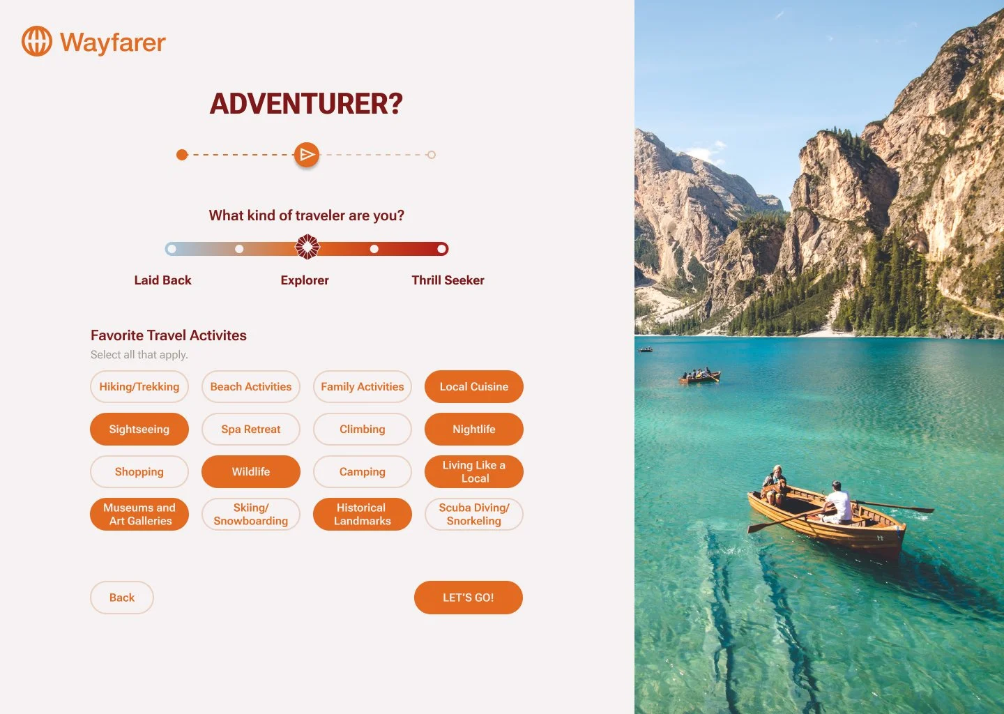
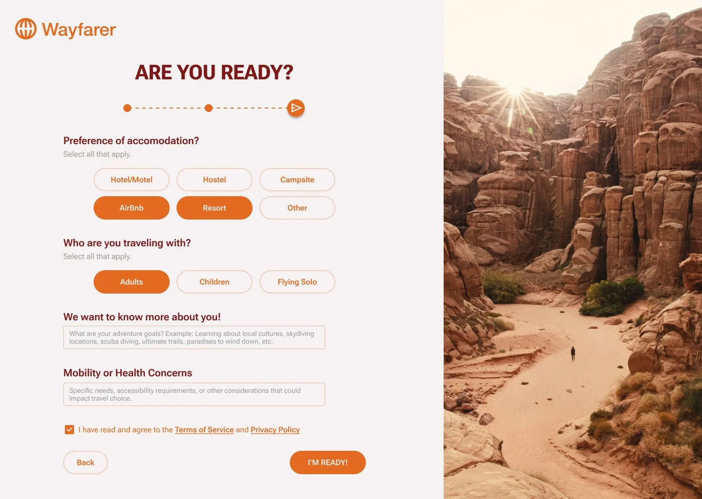
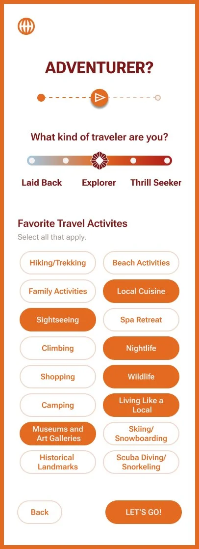
Users answer a series of travel preference questions while creating an account to generate tailored destination recommendations.
Desktop

Mobile
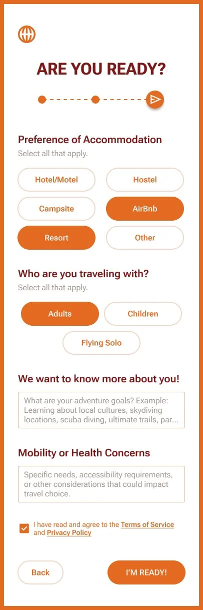

Reflection
Wayfarer gave me the opportunity to explore how visual design and responsive interfaces work together to create an engaging travel experience. Designing for both desktop and mobile challenged me to think about consistency, hierarchy, and how users move through each step of the journey. If I continued developing the project, I'd expand the recommendation experience through user testing and additional personalization features.